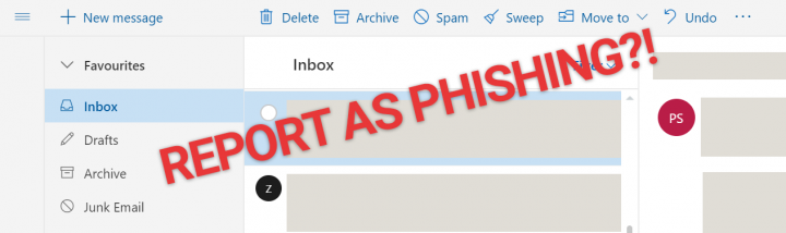
Why Can't I Report Scam & Phishing Emails On Outlook.com Beta?
A new beta version rolled out a few months ago with a new look and feel, together with some interface changes. Overall, it's an improvement with a few quirks, but there's one thing that really bothers me. They've removed the option to mark and report an email as "Phishing scam" if the email is in your inbox folder. This is annoying because I do get sketchy emails sometimes that get passed their spam detection. Especially the ones that look like it's from Apple or PayPal, which look pretty authentic at first glance. In the old outlook.com, you could mark it as such by going to "Junk > Phishing scam".Read more

Annoying Razer Synapse Updates
Ever since I installed Razer Synapse (Cloud-Based Mouse Driver) for my DeathAdder mouse I get very annoyed by the software updates. First of all, 99% of the time the update will require you to reboot your system which no ones likes. Especially when you just booted up your computer. Second, the windows where you confirm the update installation is pretty stupid as well.
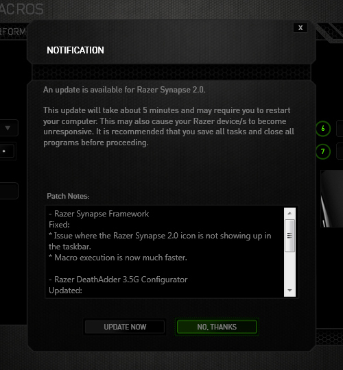
The image below is the default state in which the notification was presented. The "Update Now"(OK) option comes before the "No Thanks"(Cancel) option. Now there's always the debate whether the button arrangement should be "OK-Cancel" or "Cancel-OK". Both button orders are legitimate as the Nielsen Norman Group article points out, but what confused me was the button highlight. While updating the driver would be considered a "dangerous" action. I was immediately drawn to pressing the highlighted button, because in most UI cases they will highlight the option that they want you to press. So combined with the "I-just-want-to-get-this-over-with" mentality, I pressed the highlighted "No Thanks" option thinking it was updating when the window minimized to the system tray. Little did I know the update notification popped up again the next day when I turned on the computer... confused and enraged why Razer Synapse asked me to update again, I then discovered I was pressing the wrong button when I saw the update window for the second time. Am I raging about nothing? Or maybe I should just learn to read next time :(
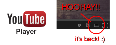
YouTube's Player Size Button is Back!

Hooray!! The YouTube player size button is back! A couple a days ago YouTube got a major update (Google+ comment integration) and it seems like they moved the player size button back to the video menu bar. In their previous update the player size button was moved and nested inside the cogwheel button. This was a huge pain in the ass since it required an extra step to perform an option that was very frequently used (you can read about the design and interaction analysis in my previous blog post).
Luckily, YouTube decided to put the player size button back on the video menu bar. Did they get too many complaints or did they just realize it was a horrible UI design choice? Anyway, hopefully they will put back the video quality button back is well haha.. To close this post, I would like to include the sound clip from Super Smash Bros below to celebrate the return of the video size button :)

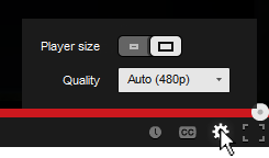
YouTube's New Video Player UI
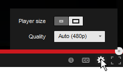
You've probably noticed the subtle change in the YouTube video player UI implemented a few days ago. They moved the "Player Size" and "Video Quality" buttons and incorporated them into the Cogwheel button. Their goal was to make the video player UI more compact and they've achieved that doing so.
Personally, I hate the new UI... not because I hate change, but because they moved the 2 of my most used buttons and nested them within another one. From an interaction standpoint the previous UI was simple:
- Set to Player Size: (1) Press Player Size button
- Change quality: (1) Press Video Quality button, (2) Set desired quality
Now with the new video player UI I have to perform an extra interaction in order to change the screen size and video quality:
- Set to Player Size: (1) Press Cogwheel button, (2) press Player Size button
- Change quality: (1) Press Cogwheel button, (2) Press Video Quality button, (2) Set desired quality
One extra interaction doesn't seem much, but for me and I think for a lot of other users it's an annoyance. Also, visually the new Player Size button is a bit weird. It looks like a toggle switch but it acts as a slider. I get confused sometimes thinking the "darker" side is the active one.. it's actually the other way around. To make it more intuitive and clear, there's a simple fix simply by adding a more distinctive rounded corner and by adding a drop shadow to the activated side.
Outlook.com's UI Inconsistency
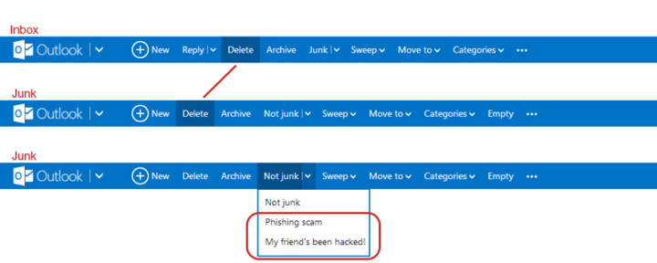
I like Outlook.com (revamped Hotmail), but there's an inconsistency in the Outlook.com's user interface which kind of bugs me. When switching from the inbox to the junk page, the "Delete"-button shifts to the left. If I'm in a hurry deleting emails from my inbox and junk, switching between the pages will cause me to accidentally pressing the "Archive"-button when I actually want to delete the email. Also, there's the weird categorization where they put the options to flag the junk mail message as "Phishing scam" and "My friend's been hack!" under the button "Not Junk"... Isn't that the opposite?
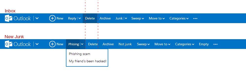
They could have move the phishing and hacked option under a new tag called "Phishing" for example, and place it left of where the "Delete"-button is. This way it shifts the delete to the right making everything more of less aligned and consistent with the Inbox UI.
[How] Print Screen with Cursor
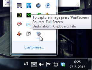
![]() Shocking discovery the other day... you CANNOT have your mouse cursor be visible when you make a print screen using the print screen button. Now, I've known that the cursor won't show up in print screens, which is awesome and useful usually, but there's actually no way to make the cursor visible in Windows 7 (not sure if it's possible in older versions.. I remember XP used to?). Looked all over the internet with no results. The best option is to install a 3rd party software such as Gadwin Print Screen.
Shocking discovery the other day... you CANNOT have your mouse cursor be visible when you make a print screen using the print screen button. Now, I've known that the cursor won't show up in print screens, which is awesome and useful usually, but there's actually no way to make the cursor visible in Windows 7 (not sure if it's possible in older versions.. I remember XP used to?). Looked all over the internet with no results. The best option is to install a 3rd party software such as Gadwin Print Screen.
Gadwin Print Screen is easy to use and it can other ride the current print screen button or other button if you like. You can toggle the cursor to be visible or not. Also, change the capture directory and the file type of your print screen. When downloading, make sure you download the freeware version, unless you're willing to pay for the pro version. So far, the freeware version works great! And the best thing is they aren't trying to force you to buy the pro version with watermarks or anything. Finally, print screens with cursors again!!! Great... right?


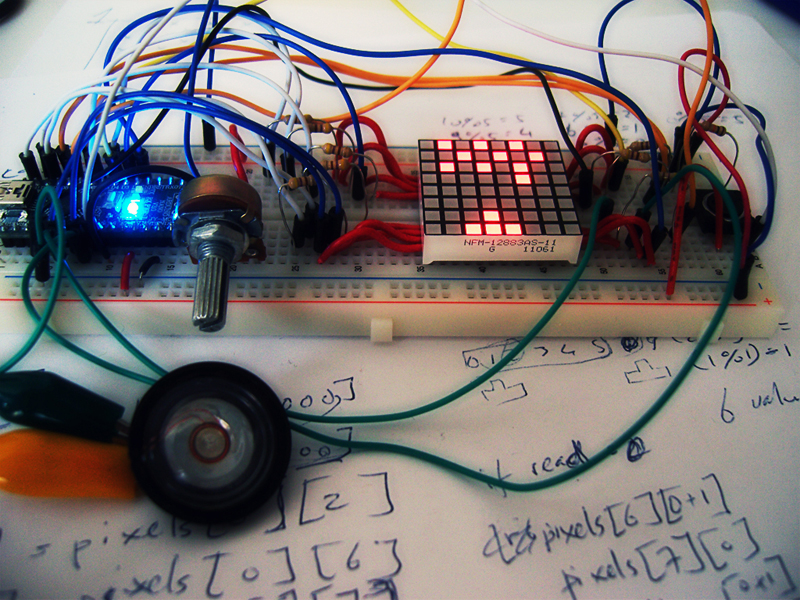
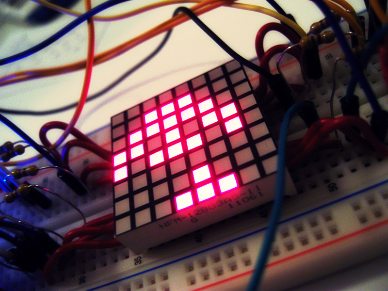
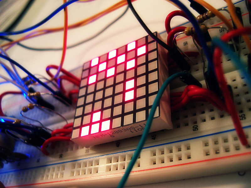
Space Invaders 8x8 LED Matrix
Finally uploaded the video of my Space Invaders game on an 8x8 LED Matrix using an Arduino Nano.
For more info check out my portfolio page Space Invaders - 8x8 LED Matrix
http://www.youtube.com/watch?v=M8C3GZfQZqc&hd=1
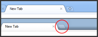
Chrome's New Tab Button UI
Have you noticed the small change in the Chrome UI? The "+" is gone in the "New Tab"-button! It's been bugging the shit out of me since I saw it a few days ago. Something doesn't feel right without the "+" :(
