HTML: Fixed Column Width Regardless of Content
I was doing some scripting in PHP to create tables with data drawn from a database. Drawing multiple fields using the same script caused the table layout to shift. This can be fixed using the tag within the table. I thought it was kind of interesting, so I thought sharing it using an example.
An example of a 3 column table setup would be something like this:
<table width="400" border="1">
   <?php $table_count = 0; ?>
      <?php if(count($this->items) > 0):   //if there's content
         foreach($this->items as $content):   //loop through all content
            if( $table_count == 0 ): ?>
               <tr>
      <?php endif; ?>
         <td width="33%">   //to create 3 columns
            //insert content here
         </td>
            <?php if( $table_count == 2 ): ?>   //3 columns, so table_count = 3 - 1 = 2
               </tr>
            <?php $table_count = 0; ?>   //column length reached, reset count
               <?php else: ?>
                  <?php $table_count++; ?>
            <?php endif; ?>
</table>
I was using the same script to parse multiple database fields onto 1 page. E.g. an employees page of a company. The page would display all the employees categorized in different positions within the company, so the number of people per position varies.
The script shown above would be used for all the categories to create a 3 column table.
Creating the table works fine, if we parse content of 3 or more items from the database to PHP. But a problem occurs with the layout if there are less items than the number of columns within a category.
Example with enough items:
| Item 1 | Item 2 | Item 3 |
Example if the database field has only 2 items (using the same script)
| Item 1 | Item 2 |
To fix this, simply add a table-layout CSS style and <col>
><table width="70%" style="table-layout:fixed">
                     <col width="33%">
                     <col width="33%">
                     <col width="33%">
Have fun :)
Unable to open Word Files (Error)
I was going through some old documents when suddenly every single Word file threw in an error causing Word not even to launch and even using the Word Safe Mode launcher didn't help.
I got scared when not 1... not 2... but almost all my Word files started being listed as corrupted!! All my work! OH NO!!! :@
The internet suggested using the Font Restore option under "Control Panel > Appearance & Personalization > Fonts > Font Settings > Restore default font settings", but that didn't fix the problem.... I tried system restore.... NOTHING!! Until I realized that I installed some fonts about a week back.
I opened the Fonts folder and looked up the fonts that I recently installed and I noticed that the icons of those fonts had "$#@" on them instead of "ABC". I tried deleting them, but again error! Saying that the font is currently in use!! Closed all application, but still no luck...
Finally, I booted Windows in Safe Mode and it allowed me to delete those corrupted fonts. Restarted it and BAM! Everything worked again (after 2 hours or rage)! :D *phew*
In short: If you're unable to open your Word files and Word starts throwing in errors, check if you installed any fonts recently. Look them up and see if they are corrupted and delete them if they are. If you're unable to delete them, go in Safe Mode and delete it :)
[How-to-Fix] Google Maps Short URLs (old)
10 July 2011 - Found a way to get short URLs again for GoogleMaps!! :D Click here
--
30 June 2011 - Doesn't work anymore due to the implementation of Google+?
Guess we're back be stuck with super duper long GoogleMaps urls :(
--
25 June 2011 - Who doesn't use Google Maps? I use it a lot to check out locations, get travelling directions and to find restaurants and cafes. :)
Now the most annoying thing is that the URL is so damn long when you want to share your current Google Maps search with people. It clutches the whole screen and it quickly becomes chaotic when you have several links listed underneath each other.
There's a way to get short URLs on Google Maps. Go to http://www.googlelabs.com/, select "Labs voor Google Maps" on the right and enable "Short URL".
Your link will now be something like "http://goo.gl/maps/wtIy" instead of having a super long URL :)
The Unofficial LEGO Minifigure Catalog
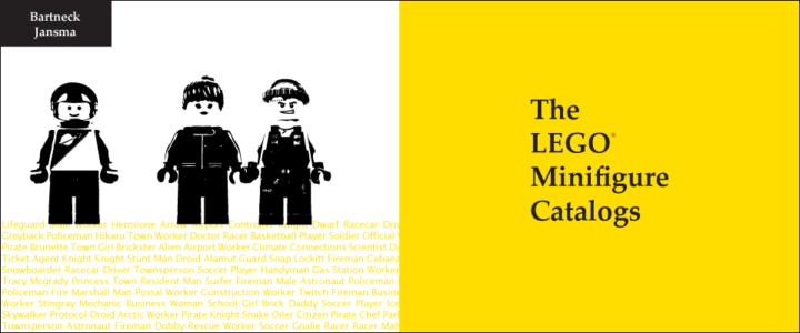
The LEGO Minifigure Catalog promotion video that I was making is up and running! The purpose of the video is to show how extensive the book actually is with over 3600 minifigure photographs with professional quality, interconnected metadata and theme taxonomy.
My contribution to the book was helping out with the design of the book, editing and processing a lot of data and pictures; scaling, cropping, color correction, etc. And after processing over 1000 photos all the figures started looking the same, especially when I was cropping out the heads for the head-index of the book.
Anyway, the book itself will be available soon, but in the meantime the book is available now! Visit http://www.minifigure.org/ to find out where to buy it! :D
http://www.youtube.com/watch?v=2VLRDt2JlLk
Premiere CS5 Blue Lines
 I rarely use Adobe Premiere. A week ago, I made some animation clips in Flash and wanted to stitch them together in Premiere. Editing the video went all well, but when I tried exporting the movie it created these blinking blue lines in my video :S
I tried exporting it as .mov, .wmv, H.264, .avi, etc. but nothing worked! :@
What did remove the blue lines was was exporting my video as MPEG-2. But then the interlacing was screwing up my video. Turning off the interlacing lowered the quality so much that it really looked like crap....
Finally, I figured out that the problem was the discrepancy of the FPS between my source videos and the exported video file. My Flash animations were in 30fps while the video exported in Premiere was 25fps.
I changed it in Flash, exported the final video with Premiere and there no more blue lines and the interlacing wasn't a problem :D :D The video is done and will be posted really soon!!
Another solution is to put a title over the flashing video and set the opacity to 0, it forces Premiere to re-render the area.
Hope this post will help and save someone some headaches :)
Away3D - Transparent Planes
I saw that my blog had some search hits for Transparent Planes in Away3D. So if anyone is still looking for it, here's the code to create a transparent plane. Hope this helps! :)
var matBlank:WireColorMaterial = new WireColorMaterial(0xFFFFFF);
matBlank.alpha = 0;
matBlank.wireAlpha = 0;

var plane:Plane = new Plane({material: matBlank, width: 200, height: 200});
Away3D - Outlining Hotspot on 3D Plane Image
I'm learning Away3D at the moment instead of PaperVision3D for a project at the HITLab. PaperVision is kind of outdated and the latest version was causing trouble for creating interactive panoramas.
In the example above;
- Rotate the view by clicking the background and drag the mouse.
- The bidoof is the hotspot and will change color when pressed.
- Outline moves along the z-axi when tilted to show the 2 separate layers (background & hotspot).
The idea behind this is to create an actual outline of the hotspot on the panorama picture instead having an image (e.g. arrow) overlapping the background image to indicate a hotspot.
To achieve this, I placed 2 planes; background and hotspot, on top of each other. The hotspot image is a cutout of the background image with a transparent background. The images are then mapped onto the planes and placed on top of each other accordingly. Flash ignores the transparency in the hotspot image, so placing the image on a plane wouldn't effect the image.
Next apply a "GlowFilter" to the hotspot image, set the strength to a high value and set Knockout = true, to create an outline. The hotspot object might disappear when moving the camera around. To fix this, move the object slightly in front of the background, e.g. value of "0.5", which won't be visible to the viewer anyway. And set the "pushback" and "pushfront" accordingly (this saved my day!). Compile the file and tada! :D
background = new Plane( {material: BackgroundImage, width: 800, height: 600 } );
background.rotationX = -90;
background.rotationZ = 180;
background.ownCanvas = true;
background.pushback = true;
view.scene.addChild(background);

var objectGlow:GlowFilter = new GlowFilter(0xff1616, 1, 8, 8, 20, 1, false, true);
object = new Plane( { material: ObjectImage, width: 250, height: 250 } );
object.x = -158;
object.y = -65;
object.z = 0.5;
object.rotationX = -90;
object.rotationZ = 180;
object.ownCanvas = true;
object.filters = [objectGlow];
object.useHandCursor = true;
object.pushfront = true;
view.scene.addChild(object);
Project Blender - Day4: Eye for an Eye
Blender weekend has ended! :( Did the Eyeball Tutorial from Blender Cookie and extended the image by placing more eyeballs in different colors. Next to Blendering, I went and bought some lamb at the Countdown (20% DISCOUNT!!!) and made some lunch; Lamb with oil, salt, pepper and fresh rosemary cooked in a 160C oven for 15-20 minutes :333
Ok time for bed! It's 2.32AM and tomorrow is Monday, which means back to the lab. Also I'm going to start learning Papervision 3D soon for the chemical processing project :D


