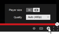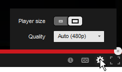
You’ve probably noticed the subtle change in the YouTube video player UI implemented a few days ago. They moved the “Player Size” and “Video Quality” buttons and incorporated them into the Cogwheel button. Their goal was to make the video player UI more compact and they’ve achieved that doing so.
Personally, I hate the new UI… not because I hate change, but because they moved the 2 of my most used buttons and nested them within another one. From an interaction standpoint the previous UI was simple:
- Set to Player Size: (1) Press Player Size button
- Change quality: (1) Press Video Quality button, (2) Set desired quality
Now with the new video player UI I have to perform an extra interaction in order to change the screen size and video quality:
- Set to Player Size: (1) Press Cogwheel button, (2) press Player Size button
- Change quality: (1) Press Cogwheel button, (2) Press Video Quality button, (2) Set desired quality
One extra interaction doesn’t seem much, but for me and I think for a lot of other users it’s an annoyance. Also, visually the new Player Size button is a bit weird. It looks like a toggle switch but it acts as a slider. I get confused sometimes thinking the “darker” side is the active one.. it’s actually the other way around. To make it more intuitive and clear, there’s a simple fix simply by adding a more distinctive rounded corner and by adding a drop shadow to the activated side.

Related Posts
April 3, 2011
Flash AS3 TextField buttonMode
June 21, 2012
Illustrator: Free Transform Tool
July 28, 2011
[How-to-Fix] Joomla!: Enabling Object, Embed & Iframe
How to enable object, embed & iframe tags in joomla for adding YouTube and Google Maps
April 4, 2011
Google Chrome – Recovering Deleted Bookmarks
1 Comment
Add comment Cancel reply
This site uses Akismet to reduce spam. Learn how your comment data is processed.


[…] required an extra step to perform an option that was very frequently used (you can read about the design and interaction analysis in my previous blog […]